The Red Cliff of Surrey
An Appreciation by Gavin Chappell
Summer 2014
The designs that Sir Edwin Lutyens used are many and varied, all intriguing and interesting but primarily all beautiful. The influences of his designs are the source of much debate, I share the view that he was influenced by everything he saw, Delius did not invent the cuckoo, rather he has influenced by it. There are many aspects to his decisions prior to the construction, what are the local materials available, what are constraints of the site, what are the demands of the client.
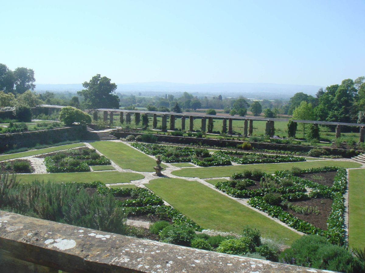
We are going to look at one aspect of these in this tour – what are the constraints of the site? I am aiming to show a link between the site and the way Lutyens overcomes the situation presented. In this case building on a sloping site. Lutyens was very skilled at using variation in the ground to enhance the drama of his buildings and gardens. The layout of the garden at Hestercombe shows how the view can be brought into the garden, highlighting the drama within. So a series of terraces at different levels brings enormous interest to the design, each one adding to the overall effect.
The standard approach to these sloping sites is to put a series of terraces, on which each of the elements is built, house on one level, garden on another. At Hestercombe there are two gardens one above the house and one below. It is an accepted method of building, an accepted understanding of design. However Lutyens took another look at this accepted view, in the same way that took another look at pillars and their design, working out a new geometry and making it his own. What if on a sloping site, instead of changing the level between the garden and the house, you changed the level across the house? In essence you get a house with one or two storeys on one side and two or three on the other.
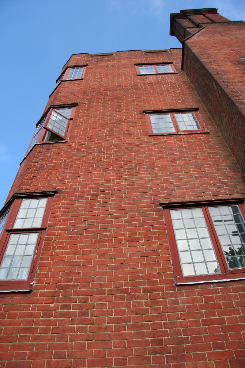
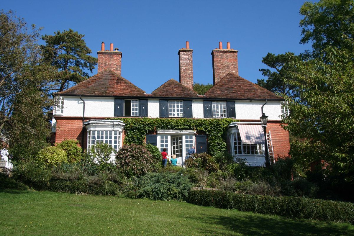
The Red House (1897) has the idea, with two storeys on the front and three on the rear facade. Here the canted bays are in brick, with wooden mullions and transoms painted to look like brick. The effect is high drama, a cliff like wall rises above the garden and the valley below. However the entrances are predominantly on the same floor and there is no rear access to the garden.
Littlecroft (1899) in Guildford, on the other hand offers us both front and rear access, leading from the front door at street level, down the stairs of the hallway (beautifully top lit) and out the rear of the hall into the garden.
What looks like a single storey from the street, is a two storey house from behind. The change in level inside is both a challenge to the designer and to the occupier. It has changes in level across the house and creates a wonderful play of spacial dimension. These changes are made in the public circulatory spaces keeping the rooms on the same level.
Fisher’s Hill (1900) for Gerald Balfour and his wife Elizabeth nee Bulwer Lytton (elder sister of Emily, Sir Edwin’s wife) is a remarkably beautiful house.
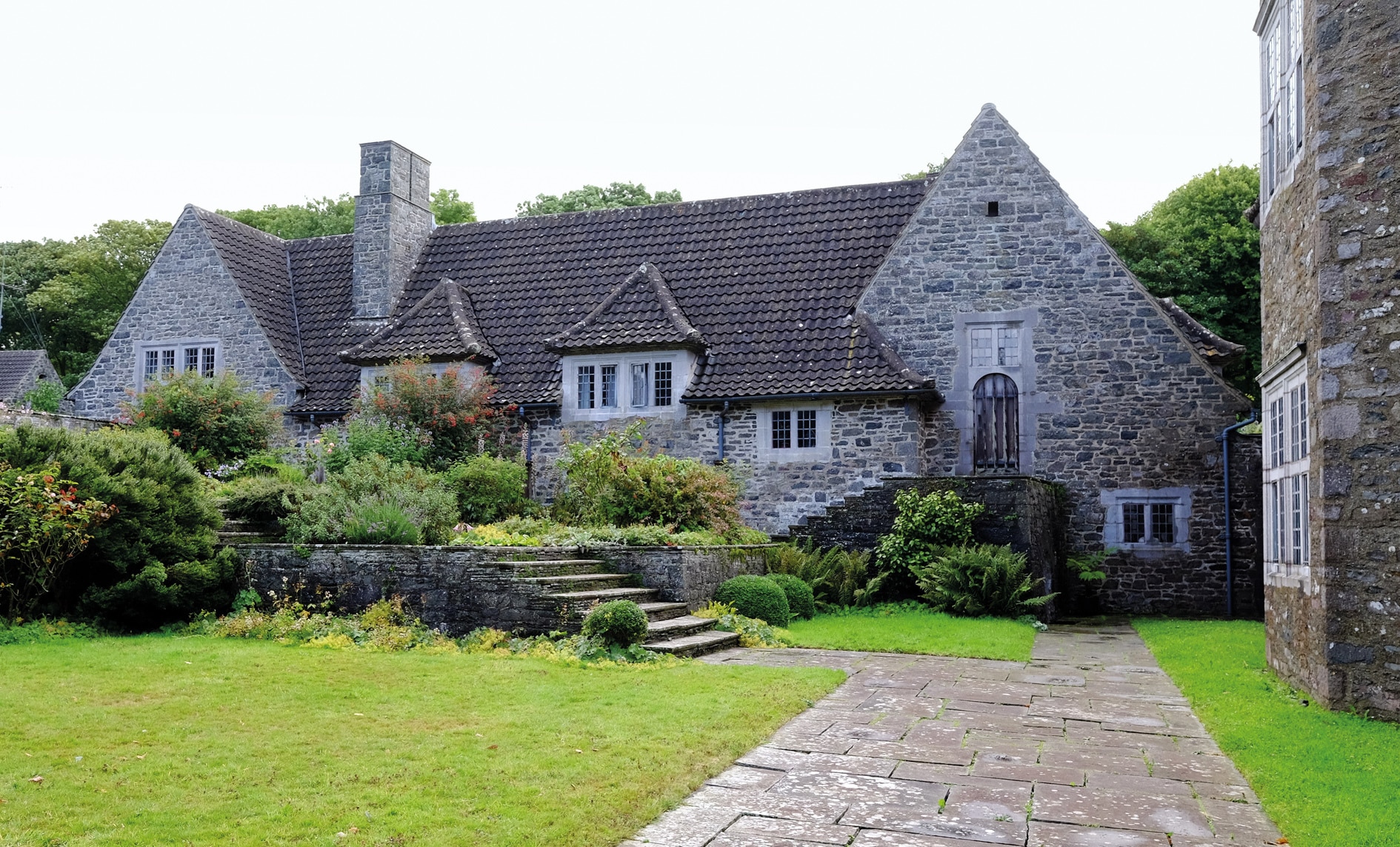
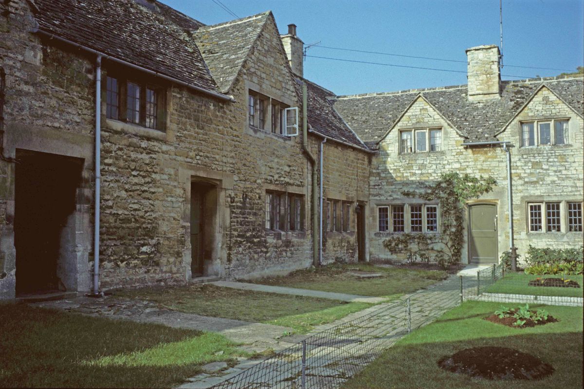
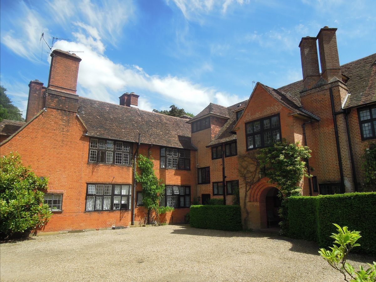
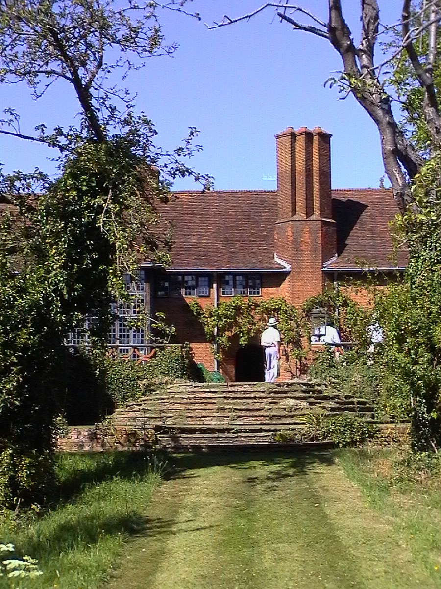
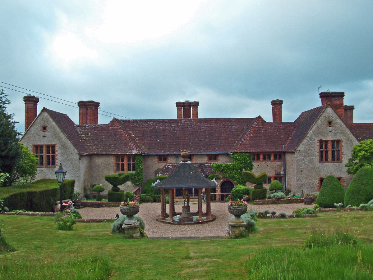
Developed on a site gently sloping away to the south and the west, the drama begins with the approach to the front from the east, via a forecourt flanked on three sides by building. Open to the west the ha-ha hides the extent of the drop. The attention is held on the north front by the glorious two storey porch, flanked by the magnificent twin flued chimney stack. A similar arrangement was to reach new heights on the garden front at Deanery Garden (1901) a year later, one of Lutyens’s most famous compositions. Here I feel it is at its most harmonious, with the doorway of the porch reaching out into the forecourt to invite you into the house, the tall chimney an indicator of the warmth of the reception.
The real drama here, much like at Barton St Mary (1906) is that the house is not revealed in all its glory at first glance. The approach from the east only reveals the east side of the house, then followed by the north facade with its entrance. The west side can not be seen at all from the forecourt, but a separate driveway further to the north takes a down hill slope leading to the coach house and stables which frame the north side of the forecourt. Again using the slope to great effect the coach house appears sunken from the forecourt as you only see the roof, yet on the north side is single storey. Around the west of the coach house brings you to the most dramatic elevation.
This is now the entrance to one of the parts of the house when it was divided, and is very spectacular, giving a three storey facade. The similarity to The Red House is striking even though here there is a pitched roof rather than the parapet. The canted bays rise in the same dramatic fashion giving a cliff like appearance.
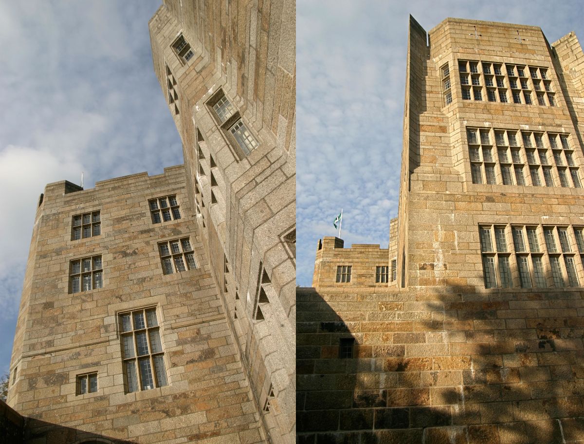
These multi-storeyed canted bays can be seen to reach the zenith in Lutyens’s designs at Castle Drogo (1910). On all four elevations they are used to add drama to the site and to give the impression of the castle rising like a cliff from the rocky outcrop of stone on which it is built. Almost as if the castle had been extruded from the earth like a volcano forcing its way skyward.

 Follow us on X
 Follow us on Instagram
 Follow us on Facebook
 Follow us on YouTube
